%20(1).png)
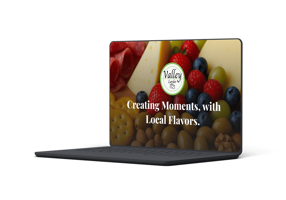
Valley Larder Farmhouse Cafe
Streamlining digital access to fresh, local food by unifying the Farmhouse Cafe’s ordering and catering services.
Project Overview
Timeline: 2 Months (March–April 2025)
Role: End-to-end UX/UI Designer & Researcher
Tools: Figma
I designed a unified and responsive website for Valley Larder Farmhouse Café to eliminate the confusion caused by their fragmented digital presence. Customers frequently mixed up the Café’s daily menu with the Custom Catering services, resulting in poor navigation, unnecessary phone calls, and missed business opportunities.
01
The Chanllenge
01
Introduction
Project Background
Valley Larder runs two core services under one brand: a bustling Farmhouse Café and a high-value Custom Catering business. Their online presence was fragmented — menus scattered, navigation unclear, and customers constantly mixing up “daily café menu” with “catering packages.”
The goal was to design a single responsive website with a unified ordering and inquiry flow that reduces confusion, streamlines ordering, and positions both services clearly.
Goals & Objectives
-
Improve Information Architecture: Create clear separation between Café and Catering from the first interaction.
-
Streamline Ordering: Build an intuitive online ordering flow for takeout customers.
-
Increase Catering Leads: Make inquiries prominent and friction free.
-
Maintain Brand Tone: Combine farmhouse warmth with modern clarity.
Constraints
-
Need to prioritize fast takeout orders while also showcasing premium catering.
-
Limited time to build a scalable IA for both B2C and B2B users.
-
Two very different services competing for user attention.
02
Research
-
People frequently call to “find the menu” — too much confusion.
-
Café and Catering fight for attention; separation is essential.
-
Tone must stay warm, rustic, and community-focused.
-
Users constantly confused café menu vs catering packages.
-
“Menu” is the #1 searched term — but users landed on the wrong pages.
-
Navigation must be built around two dominant pathways:
-
Order Now (Café)
-
Plan an Event (Catering)
Stakeholder & Business Research
User Research & IA Findings
Interviews with the owners revealed consistent themes:
Through card sorting + guerrilla testing:
(Affinity maps and IA visuals appear here — same style as your previous case studies.)
03
Define
Future Phases
-
POS integration for real-time inventory/loyalty
-
Blog for local stories + seasonal specials
-
E-commerce for branded products
-
Catering quote calculator or availability checker
-
Responsive homepage with two clear pathways
-
Dedicated Café page with an optimized menu + ordering link
-
Dedicated Catering page with structured tiers and inquiry form
-
Essential info: hours, location, contact
-
High-quality photography across the site
Feature Roadmap
Design Principles
Clarity Over Clutter
Minimize cognitive load
Authentic Warmth
Reflect the rustic farmhouse aesthetic
Efficiency Focus
Especially for quick café orders
Key Benefits
01. Dual-Path Hero Section
A split-screen hero that forces instant clarity:
-
Order Now — strong food imagery, direct to menu
-
Plan an Event — catering visuals, direct to for
Solved the #1 problem: service confusion.
03. Integrated Catering Inquiry Form
Clean, structured, and built to capture only essential details.
Allowed staff to receive better-qualified leads without calls.

The homepage IA centered on a split hero layout guiding users instantly to the right path.
04
Information Architecture & Wireframes
Design
02. Sticky “View Menu” Button
Pinned on mobile to keep the café menu always within reach.
Reduced menu-hunting frustration drastically.
Branding & UI Visuals
-
Color Palette: Earthy greens, browns, creams
-
Typography: Serif for headers (farmhouse warmth), Sans-serif for readability
-
UI Style: Clean card layouts, high-contrast food imagery
User Feedback Highlights
-
Users loved the clear separation of services.
-
Many wanted to see food photos before opening the menu.
-
Catering clients asked for availability/blackout date visibility.
05
Iterations & Improvements

User Feedback Highlights
-
Photo-rich Menu System
-
E-commerce Module for seasonal and local goods
-
Catering Quote Calculator
-
Availability Checker

06
Results & Impact
The redesigned Valley Larder website successfully resolved the core issue of service confusion by introducing a clear, dual-path information architecture that distinguishes Café ordering from Custom Catering inquiries from the very first interaction. This clarity significantly reduced cognitive load for users, allowing customers to immediately identify the action relevant to their intent, whether placing a quick takeout order or planning a large event, without navigating irrelevant content.
By streamlining the café ordering experience and keeping the menu consistently accessible through a sticky “View Menu” action on mobile, the new design reduced friction in the most frequent user flow. Customers were able to move from discovery to checkout more efficiently, decreasing abandonment caused by menu hunting or unclear navigation. As a result, the café’s online ordering experience became faster, more intuitive, and better aligned with user expectations for modern food service websites.
For the Custom Catering service, the introduction of a dedicated, structured inquiry page transformed a previously informal and fragmented process into a purposeful lead-capture system. The integrated inquiry form collected essential event details upfront, reducing back-and-forth communication and enabling staff to respond with greater context and efficiency. This shift positioned catering inquiries as a premium service experience rather than a secondary afterthought, improving both lead quality and internal workflow.
From a business perspective, the unified digital platform reduced the administrative burden placed on staff by minimizing phone calls related to menu clarification and service confusion. The scalable design system also laid the foundation for future growth, including e-commerce expansion, loyalty programs, and advanced catering tools. Overall, the project strengthened Valley Larder’s digital presence, aligning the online experience with the quality of its food and service while supporting sustainable, conversion-focused growth.