.png)
Stone House Vineyard
An End-to-End Website Redesign for Elevated Brand Experience & Conversion
A premium, conversion-driven website experience designed to reflect the vineyard’s upscale destination brand.
Project Overview
Timeline: 4 Weeks (August 2024)
Role: End-to-End UX/UI Designer
Tools: Figma
I redesigned the Stone House Vineyard website to align its digital experience with the vineyard’s premium, destination-quality brand. The project focused on improving navigation clarity, increasing Wine Club enrollments, and introducing a seamless Private Events inquiry flow to support high-value conversions.
01
The Chanllenge
01
The website failed to reflect the premium, “Tuscany in Texas” brand experience.
02
Navigation was partially inactive, creating immediate user frustration.
03
Wine Club pricing was hidden, killing trust and conversions.
01
The Chanllenge
04
There was no direct, seamless way to inquire about private events.
05
Typography and content density hurt readability and accessibility.
01
Impact Goals
01
Increase Wine Club enrollment by 15%
02
Improve Reservation completion rate
03
Capture Private Event inquiries through a dedicated flow
04
Strengthen premium brand perception through elevated UI
02
Research
-
High-contrast primary CTAs
-
Tiered Wine Club comparison tables
-
Visual-first culinary menus
-
Dedicated event inquiry funnels
-
Inactive navigation immediately killed trust
-
Users refused to join the Wine Club without seeing pricing
-
Wine page typography was too small for comfortable reading
-
Event booking required a dedicated, premium flow
Competitor Benchmarking
Usability Testing (Lo-Fi)
I analyzed regional wineries and destination restaurants. Key patterns:
Method: 5 moderated in-person tests
Focus: Navigation, pricing clarity, conversion flows
03
Define
Feature Roadmap
-
Wines
-
Culinary (Menu + Chef + Events)
-
Culinary (Menu + Chef + Events)
-
Active Global Navigation
-
Transparent Wine Club Pricing
-
Private Events Inquiry System
-
Culinary + Chef Bio Integration
-
Readability Improvements
-
Users experienced immediate friction due to inactive navigation.
-
Pricing opacity blocked Wine Club conversions.
-
The absence of a clear Private Events pathway prevented high-value bookings.
Problem Statements
Sitemap Restructure
Primary paths simplified to:
USER FLOW
Key

Stone House Vineyard Explore Culinary Offerings
-
Homepage → Click "Events" (or "Culinary" link)
-
Culinary/Events Page → Scroll to "Host Your Event" section
-
Click "Inquire About Private Events" CTA
-
Private Event Inquiry Form (Collects event type, date, guest count)
-
Form Submission → Confirmation Screen & Email Follow-up
Flow: Event Inquiry
Branding & Visual Direction
-
Warm, earthy palette
-
Elegant serif headlines + legible sans-serif body text
-
Large immersive photography to convey destination appeal
Usability Iterations
Problems
Iterations
Inactive navigation
Fully activated top + hamburger nav
Hidden pricing
Added direct tier pricing + CTA pricing
Poor readability
Increased font sizes site-wide
Weak gallery placement
Replaced with dynamic hero visuals
Result:
A cohesive, premium, conversion focused website experience
04
Design & Iterations
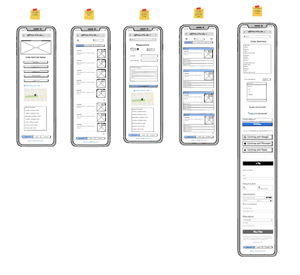
High-Fidelity Wireframes
-
Always-active navigation
-
Wine Club tiers with visible pricing + embedded CTAs
-
Improved typography hierarchy
-
Event sections built with visual storytelling
05
Final UI Design
.png)
.png)
06
User Persona
AVA CHEN, 45, Small Business Owner & Host Uses iPhone daily, high tech comfort Frequent visitor to the Texas Hill Country wine region. Wants to host her company's annual retreat at a memorable, elegant venue
Goals
-
Book weekend reservations quickly
-
Compare Wine Club tiers instantly
-
Secure a premium private event venue
Pain Points
-
Hidden pricing
-
Clunky reservation flows
-
Generic event contact forms
“If I’m paying premium prices, the website should feel premium and work flawlessly.”
07
Conclusion + Key Takeaways
This redesign transformed Stone House Vineyard’s website into a high-conversion digital host. The new experience reduces friction, improves transparency, and seamlessly guides users from brand discovery to booking, enrollment, and private event inquiry.
Key Takeaways
Transparency builds trust — pricing visibility directly supports conversion.
Navigation must always be functional — inactive UI destroys credibility instantly.
Small details compound — font size and CTA clarity meaningfully impact results.
Test early, fix the foundation first — beauty only works when usability is solid.
Reflection
This project has been a crucial step in my growth as a UX designer, particularly in solidifying my understanding of iterative design and the importance of user feedback. It was a hands-on lesson in moving from abstract concepts and lo-fidelity prototypes to a concrete, data-driven plan for a final product.
The most satisfying part was translating the brand's elegant, rustic, "Tuscany in Texas" feel into a functional digital experience. The key problem was bridging the gap between this premium brand and a functional, user-friendly digital experience that supported key conversions like reservations and wine club sign-ups.
My main insights during my research phase were that users expect immediate interactivity and pricing transparency is crucial for conversion-focused pages. The most surprising finding was the strong reaction to the inactive navigation; I had anticipated prominent CTAs would guide them, but the frustration with the non-functional navigation showed a clear user expectation for a fully-featured, active site.
My process was guided by the principle of validating assumptions early. I began by creating a lo-fidelity prototype to get straight to the core of user flows and information architecture. A key challenge I faced was deciding what to test—I questioned whether to test a broad range of tasks or to focus on a few key user goals. Ultimately, I decided to focus on the main user goals to gather deep, actionable insights rather than a shallow overview of many features.
I ensured design solutions aligned with user needs by making the usability test the cornerstone of the project, with every finding translating directly into a design revision. My main focus was the lo-fidelity prototyping and usability testing stage to fix the "bones" of the site first. The main trade-off was prioritizing the resolution of foundational usability issues (like navigation and pricing) over adding visual polish, ensuring the site was functional before it was beautiful.