Valley Larder: Designing a Responsive Website
%20(1).png)
Description:
Streamlining digital access to fresh, local food by unifying the Farmhouse Cafe's ordering and catering services.
Role: End-to-end UX/UI Designer (Focus on Information Architecture and Service Design)
Timeline: 3 Months (Sept–Nov 2024)
Tools: Figma, Optimal Workshop (Card Sorting), SurveyMonkey
01. Introduction
02. Research
03. Define
04. Design & Iterations
05. Prototypes
06. Conclusion
01. Introduction
PROJECT BACKGROUND
Valley Larder operates a local food business with two core consumer services: a bustling Farmhouse Cafe (daily takeout and dining) and a high-value Custom Catering service. Their existing digital presence was fragmented, with confusing calls-to-action that blurred the lines between the two distinct offerings. This confusion led to staff time wasted clarifying service differences and the loss of potential catering leads.
I designed a responsive website to serve as a single, clear digital hub. The site establishes a strong brand identity and delivers essential functionality by clearly separating the two service pathways and improving efficiency for both daily orders and large event inquiries.
GOALS AND OBJECTIVES
The project aimed to create a flexible design system that balanced the aesthetic warmth of a cafe with the efficiency of a high-volume ordering platform. The site was designed to:
02. Research
To understand the business’s operational challenges, I conducted in-depth interviews with the Valley Larder owners and managers. Their goals centered on reducing administrative workload caused by clarifying service differences and significantly increasing high-value Catering inquiries.
STAKEHOLDER INTERVIEWS
SECONDARY RESEARCH
To validate the confusion and inform the navigation structure, I conducted Card Sorting exercises and Guerilla Interviews with potential customers, both familiar and unfamiliar with Valley Larder.
03. Define
PROBLEM STATEMENT
Prior to this project, Valley Larder's fragmented online presence created a poor user experience, resulting in high administrative burden for staff and reduced conversion for both Café takeout and high-value Custom Catering inquiries. A standalone website was essential to:
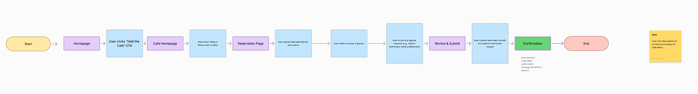
USER FLOW
Key
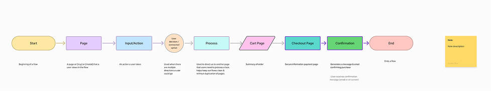
Valley Larder Make a Reservation
CONSTRAINTS
Key challenges included a limited timeframe and the core structural problem of resolving the dual-service confusion without creating a cluttered interface. The final design needed to be lightweight and visually align with the rustic "Farmhouse" aesthetic while integrating with a flexible, third-party ordering platform for the Cafe side.
04. Design
BRANDING
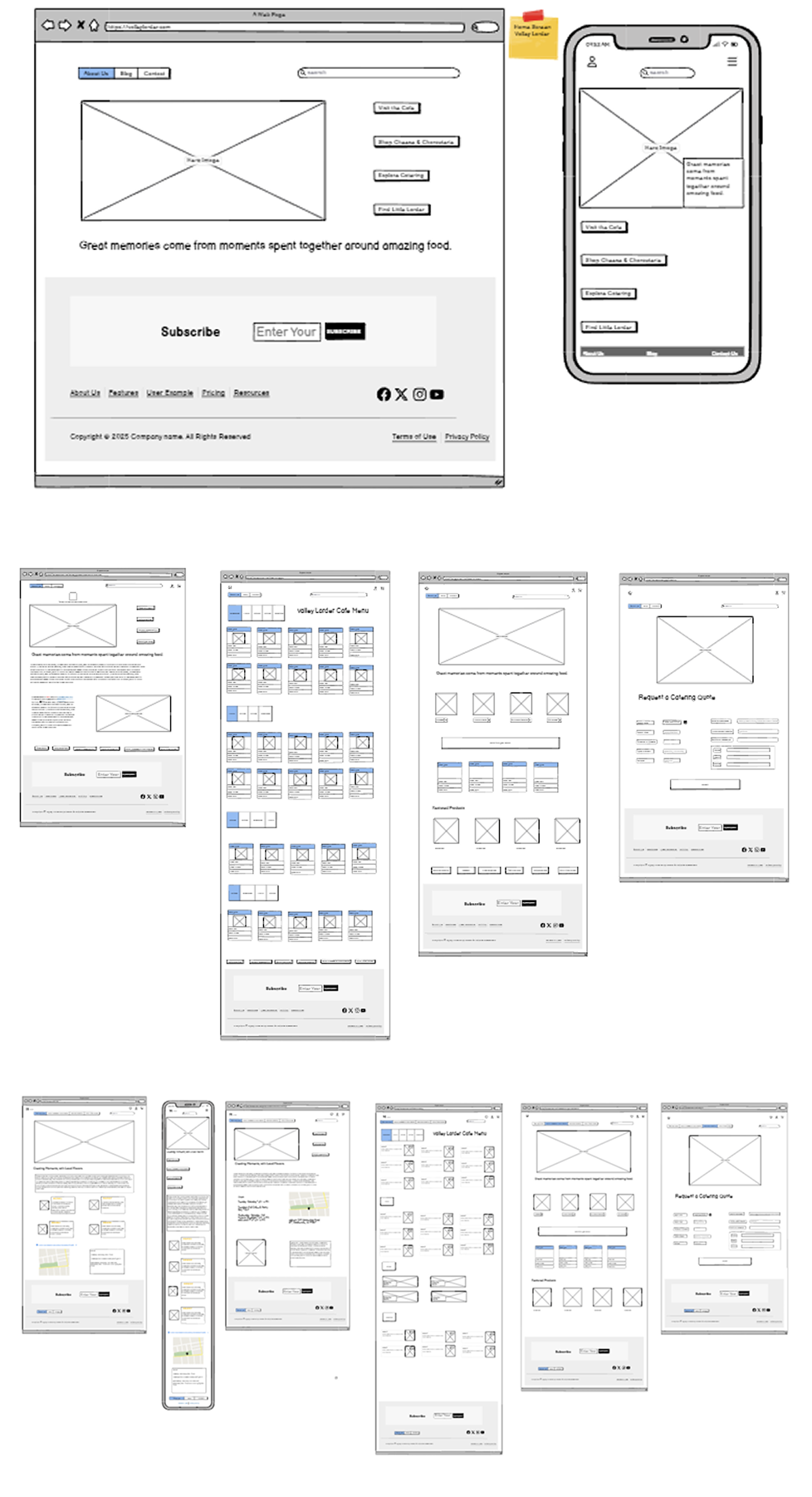
Lofi Wireframe
-
Improve Information Architecture (IA): Clearly segment the Café and Catering services to ensure users can immediately find the correct pathway based on their intent.
-
Streamline Ordering: Implement an intuitive, efficient online ordering system for the Farmhouse Cafe to reduce reliance on third-party apps.
-
Increase Catering Leads: Provide prominent, dedicated pathways to generate qualified leads for the Custom Catering service
The design approach also looked ahead to future growth—laying the groundwork for Phase 2 features such as integrated inventory management and a local vendor blog.
Key takeaways from interviews:
-
The primary digital need was a strong, easy-to-update menu for the Café with a simple online ordering flow.
-
The tone must feel authentic, community-focused, and welcoming, reflecting the Farmhouse aesthetic.
-
Flexibility was essential: The site needed to efficiently handle both high-volume daily orders and low-volume, high-value inquiries
Key findings confirmed:
-
Users struggled to distinguish between the daily menu and the formal catering packages, often wasting clicks and time.
-
"Menu" was the single most searched term, confirming the priority of the Café ordering flow.
-
Both stakeholders and community members aligned on the need for the navigation to be simplified into two dominant pathways based on intent: Order Now (Café/Takeout) and Plan an Event (Catering Inquiry).
-
Establish Clarity by separating the Cafe and Catering services at the point of entry.
-
Provide Efficient Pathways for customers to place orders or submit event inquiries directly.
-
Lay a Scalable Foundation for future e-commerce expansion beyond daily food service.
FEATURE ROADMAP
MVP — First iteration, live now:
-
Responsive Homepage: Immediate, clear choice between Café and Catering.
-
Dedicated Café Page: Clean, mobile-optimized menu display and direct link to the integrated ordering system.
-
Dedicated Catering Page: Clear service tiers and a prominent, simplified inquiry form.
-
High-Quality Photography to establish quality and appeal
Future Phases
-
Integrated loyalty program for repeat Café customers.
-
E-commerce Shop: Selling packaged artisan goods or branded merchandise.
-
Custom catering availability checker or automated quote tool.
-
Blog/Community Page featuring local vendors and seasonal recipes
DESIGN PRINCIPLES
To guide decision-making and keep scope focused, I defined three key principles:
-
Clarity Over Clutter: Simplify the IA to immediately resolve the dual-service confusion.
-
Authentic Warmth: Reflect the Farmhouse Cafe's rustic aesthetic while maintaining professionalism.
-
Efficiency Focus: Prioritize quick, seamless transaction flows for takeout customers
Valley Larder Ordering Cheese & Charcuterie

AFFINITY MAP


With the research synthesized and project goals defined, I moved into design by creating a flexible system that prioritized user intent and brand identity.
The visual design centered on balancing the Larder's rustic roots with a clean, modern interface. I leveraged the existing brand identity but formalized the visual system:
-
Color Palette: Utilized warm, earthy tones (deep greens, rich browns, creamy whites) to evoke the "Farmhouse" atmosphere.
-
Typography: Paired a traditional, legible serif font for headlines (evoking tradition) with a clean sans-serif for body text (ensuring modern readability for menus and forms).
-
Visual Strategy: Designed high-contrast image modules and dedicated card layouts to clearly separate menu items from catering packages.
05. Prototypes
Low-fidelity wireframes exploring responsive layouts. The desktop version clearly segments the Cafe and Catering content, while the mobile version utilizes a tabbed navigation for clarity and ease of use.
.png)
LEARNINGS & NEXT STEPS
-
Learned: The immense value of Card Sorting in solving complex IA issues. The simple act of classifying content by user intent was the key to unlocking the final design.
-
Next Steps: Implement a simple A/B test on the homepage hero section to validate if the "Order Now" conversion rate is higher with the split-screen design versus a traditional landing page.
-
Personal Reflection: I gained confidence in guiding stakeholders toward an MVP solution that solved their immediate pain points while providing a clear vision for scalable growth.
IMPACT
The new website established a single, professional digital identity for the business, dramatically clarifying the service offerings for customers and enabling staff to focus less on administrative tasks and more on food preparation and event planning.