Stone House Vineyard
%20(1).jpg)
Stone House Vineyard An End-to-End Website Redesign for Elevated Brand Experience and Conversion
A single, intuitive mobile application that consolidates reservations, takeout ordering, and event inquiries.
Timeline: 4 Weeks (August 2024)
Role: End-to-end UX/UI Designer
Tools: Figma
01. Introduction
02. Research
03. Define
04. Design & Iterations
05. Prototypes
06. Conclusion
Project Overview
I designed a comprehensive mobile application for Lighthouse on the Lake to streamline all customer interactions, making dining reservations and takeout ordering more efficient while providing clear pathways for event inquiries. The design prioritizes usability, navigational clarity, and visual immersion to enhance the customer experience and centralize business transactions.
THE CHALLENGE THE SOLUTION
Impact Goals
Increase Wine Club enrollment conversion rate by 15%. Improve Reservation completion rate by clarifying the booking flow. Capture Private Event inquiries through a dedicated, seamless flow. Enhance brand perception, making the digital experience feel as premium as the vineyard.
01. Introduction
PROJECT BACKGROUND
Stone House Vineyard, located in the Texas Hill Country, offers a world-class wine and culinary experience. However, the existing digital interface did not reflect this quality, leading to confusion during key user journeys like reserving a table or understanding wine club benefits. My objective was to align the website’s function and form with the high-end, destination nature of the physical business, particularly by adding a crucial pathway for private event bookings.
PROJECT GOALS
Simplify and activate site navigation to improve user efficiency. Enhance pricing transparency to build trust and increase Wine Club sign-ups. Introduce Chef Kristine and integrate the daily menu with wine pairings. Create an intuitive, conversion-focused flow for private event inquiries.
02. Research
I analyzed leading regional wineries and destination restaurants to benchmark best practices for reservations, wine club presentation, and event promotion. Key takeaways: Successful competitors featured clear, high-contrast CTAs, utilized tiered comparison charts for club memberships, and offered visual menus with detailed sourcing information.
COMPETITOR ANALYSIS
USER RESEARCH TOPICS:
Understanding visitor expectations for a destination winery website. Goal: Identify pain points in current navigation, information hierarchy, and conversion paths. Method: 5 in-person moderated usability tests on lo-fidelity wireframes. Key Findings Overwhelmed by Inactive Navigation — Users found the non-functional hamburger menu and top navigation bar frustrating, leading to initial hesitations despite finding CTAs lower on the page. Zero Pricing Transparency — Users universally requested that Wine Club pricing be displayed directly on the tier comparison page, stating they would not click "Join" without knowing the cost. Readability Issues — The font size on the Wines page was reported as too small, hindering legibility and accessibility.
03. Define
FEATURE ROADMAP
This roadmap focused on fixing the critical usability failures found in testing while introducing the new high-value feature set (Culinary & Events). Features were prioritized based on user demand and business impact (conversion). Core features include: Active Global Navigation, Transparent Wine Club Pricing, and the Private Events Inquiry System.
The sitemap was streamlined to reflect the new primary paths: Wines, Culinary (now encompassing the menu, chef bio, and private events), Visit (hours, reservations), and Wine Club. This streamlined structure helps users quickly locate their goals.
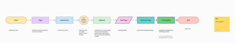
USER FLOW
Key

Stone House Vineyard Explore Culinary Offerings
-
Homepage → Click "Events" (or "Culinary" link)
-
Culinary/Events Page → Scroll to "Host Your Event" section
-
Click "Inquire About Private Events" CTA
-
Private Event Inquiry Form (Collects event type, date, guest count)
-
Form Submission → Confirmation Screen & Email Follow-up
The existing website failed to match the premium, destination quality of the physical vineyard. Users struggled with confusing navigation, crucial information (like pricing) was hidden, and there was no seamless way to book a private event, creating a barrier to high-value conversions
A fully responsive, aesthetically elevated website featuring:
-
Streamlined, Fully Active Navigation to reduce user frustration.
-
Transparent Pricing and Tier Comparison on the Wine Club page to boost enrollment.
-
Dedicated Culinary and Chef Bio Integration to showcase the quality of the dining experience.
-
A New Private Events Inquiry Flow with bespoke menu options to capture high-value leads.
The digital presence must match the premium destination experience
CONSTRAINTS
Need to maintain the elegant and rustic brand aesthetic ("Tuscany in Texas"). Requirement to integrate the newly defined Culinary/Private Event feature into existing navigation structures. High dependency on visuals (photography) to convey the destination appeal. OPPORTUNITY Create a website that functions as a high-conversion digital host, guiding visitors effortlessly from brand discovery to booking and enrollment.
Research Usability testing revealed critical friction points in core user flows
DESIGN OPPORTUNITIES
Active Navigation Fully activate all global navigation elements (hamburger and top bar) in the final design. Pricing Transparency Add pricing information to the Wine Club tier descriptions and CTAs (e.g., "Join Platinum - $X/Allocation"). Readability First Increase the font size on all product/list pages for better accessibility. Feature Integration Introduce the Chef's Bio and Private Event Inquiry as key navigable sections.
USER PERSONA
THE DISCERNING LOCAL EXPLORER AVA CHEN 45, Small Business Owner & Host Uses iPhone daily, high tech comfort Frequent visitor to the Texas Hill Country wine region. Wants to host her company's annual retreat at a memorable, elegant venue
GOALS
Quickly verify hours and book a table for weekend lunch. Easily compare the value proposition of the different wine club tiers. Find clear information on how to book a large private event.
PAIN POINTS
Frustrated by clunky reservation forms and hidden pricing. Needs quick access to menus to assess catering quality. Wants a clear contact path for event planning, not a generic email. "If I'm paying premium prices, the website needs to feel premium and work flawlessly."
Prioritizing feature additions and addressing critical usability failures.
SITEMAP
Flow: Event Inquiry
04. Design & Iterations
Design & Iterations Refining the aesthetic and fixing critical friction points based on user feedback
BRANDING & VISUAL DESIGN
The visual design leans heavily on a warm, earthy color palette and uses large, high-resolution photography to convey the "Tuscany in Texas" ambiance. Typography features an elegant serif for headlines (to signify sophistication) paired with a highly legible sans-serif for body text (ensuring readability). The aim was to create a visual experience that is both sophisticated and inviting.
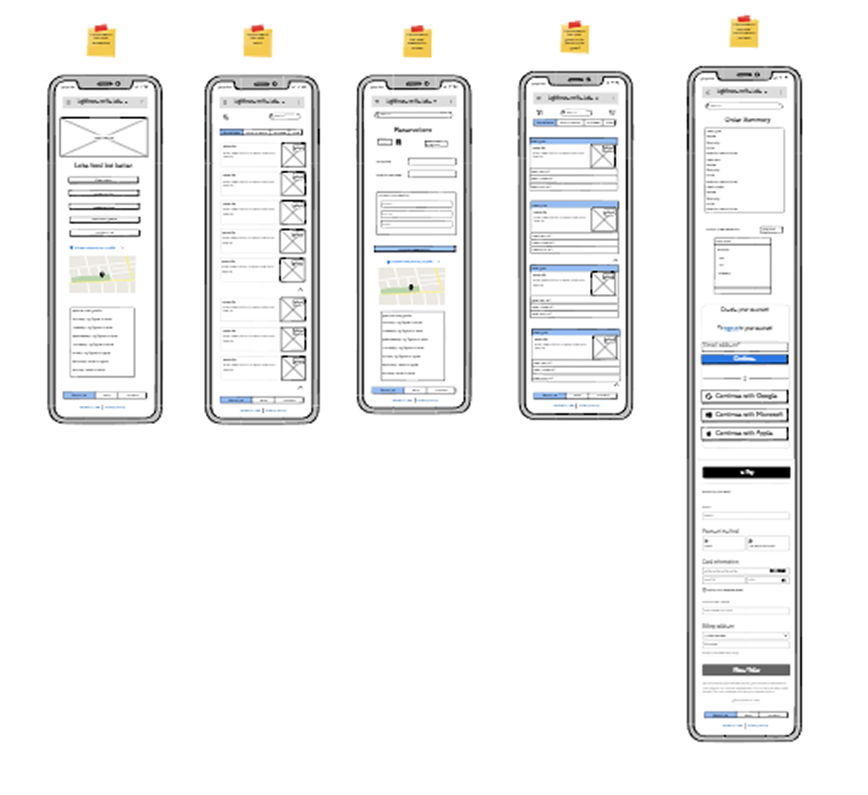
HIGH FIDELITY WIREFRAMES
The high-fidelity mockups implemented the solutions identified in the testing: the top navigation is always visible and fully interactive; Wine Club tiers now feature prominent price badges and integrated CTAs; and the Wines page utilizes increased font sizing and ample white space for better scannability. The Private Events section utilizes large, inspirational photography and clear, concise descriptions of available services (pairing dinners, large celebrations) leading to a dedicated inquiry form.
USABILITY TESTING & ITERATIONS
Early lo-fidelity usability tests confirmed major usability issues, which were systematically addressed:
Problem 1: Inactive Navigation.
Iteration: Fully activated the top navigation bar and hamburger menu to meet user expectations for immediate site functionality, reducing initial frustration.
Problem 2: Hidden Pricing.
Iteration: Added clear price points directly below the Wine Club tier name and integrated pricing into the "Join" CTAs (e.g., "Join Platinum - $199").
Problem 3: Readability.
Iteration: Increased font size on the Wines page and body text site-wide to meet accessibility standards and improve comfort for prolonged browsing.
Problem 4: Gallery Placement.
Iteration: Removed the low-priority gallery, replacing it with a more dynamic and image-focused hero section and integrating key visuals into contextual sections (e.g., event photos on the Culinary page). RESULT The final design iteration resulted in a cohesive, aesthetically aligned, and highly functional website that directly solved user pain points and integrated the key new feature for high-value event inquiries.
Lofi Wireframe
05. Prototypes WINE CLUB TRANSPARENCY
06. Conclusion
KEY TAKEAWAYS
The Stone House Vineyard project reinforced just how vital testing is, even for seemingly simple informational websites. The initial design, while aesthetically pleasing, failed on core usability principles like transparency and responsiveness.
Reflection
This project has been a crucial step in my growth as a UX designer, particularly in solidifying my understanding of iterative design and the importance of user feedback. It was a hands-on lesson in moving from abstract concepts and lo-fidelity prototypes to a concrete, data-driven plan for a final product.
The most satisfying part was translating the brand's elegant, rustic, "Tuscany in Texas" feel into a functional digital experience. The key problem was bridging the gap between this premium brand and a functional, user-friendly digital experience that supported key conversions like reservations and wine club sign-ups.
My main insights during my research phase were that users expect immediate interactivity and pricing transparency is crucial for conversion-focused pages. The most surprising finding was the strong reaction to the inactive navigation; I had anticipated prominent CTAs would guide them, but the frustration with the non-functional navigation showed a clear user expectation for a fully-featured, active site.
My process was guided by the principle of validating assumptions early. I began by creating a lo-fidelity prototype to get straight to the core of user flows and information architecture. A key challenge I faced was deciding what to test—I questioned whether to test a broad range of tasks or to focus on a few key user goals. Ultimately, I decided to focus on the main user goals to gather deep, actionable insights rather than a shallow overview of many features.
I ensured design solutions aligned with user needs by making the usability test the cornerstone of the project, with every finding translating directly into a design revision. My main focus was the lo-fidelity prototyping and usability testing stage to fix the "bones" of the site first. The main trade-off was prioritizing the resolution of foundational usability issues (like navigation and pricing) over adding visual polish, ensuring the site was functional before it was beautiful.
The key takeaways I gained are: Test Early and Test Often, Transparency Builds Trust, and No Detail is Too Small (like font size) to impact the experience.
.png)
.png)